Daikin
Mobile application design
/2020

Candid
"Gamifying customer care"
Mobile application
/2019
Team:
Rose Pender, UI Designer & Project Manager
Riley Hamilton, UX Designer
Yanni Xiang, Research Lead
Timeline:
3 weeks
Tools:
Sketch, Adobe XD
Process:
Market Research
Survey & Interviews
Affinity Mapping
Personas
Journey Map
User Flows
Paper Prototype
Wireframes
Digital Prototype
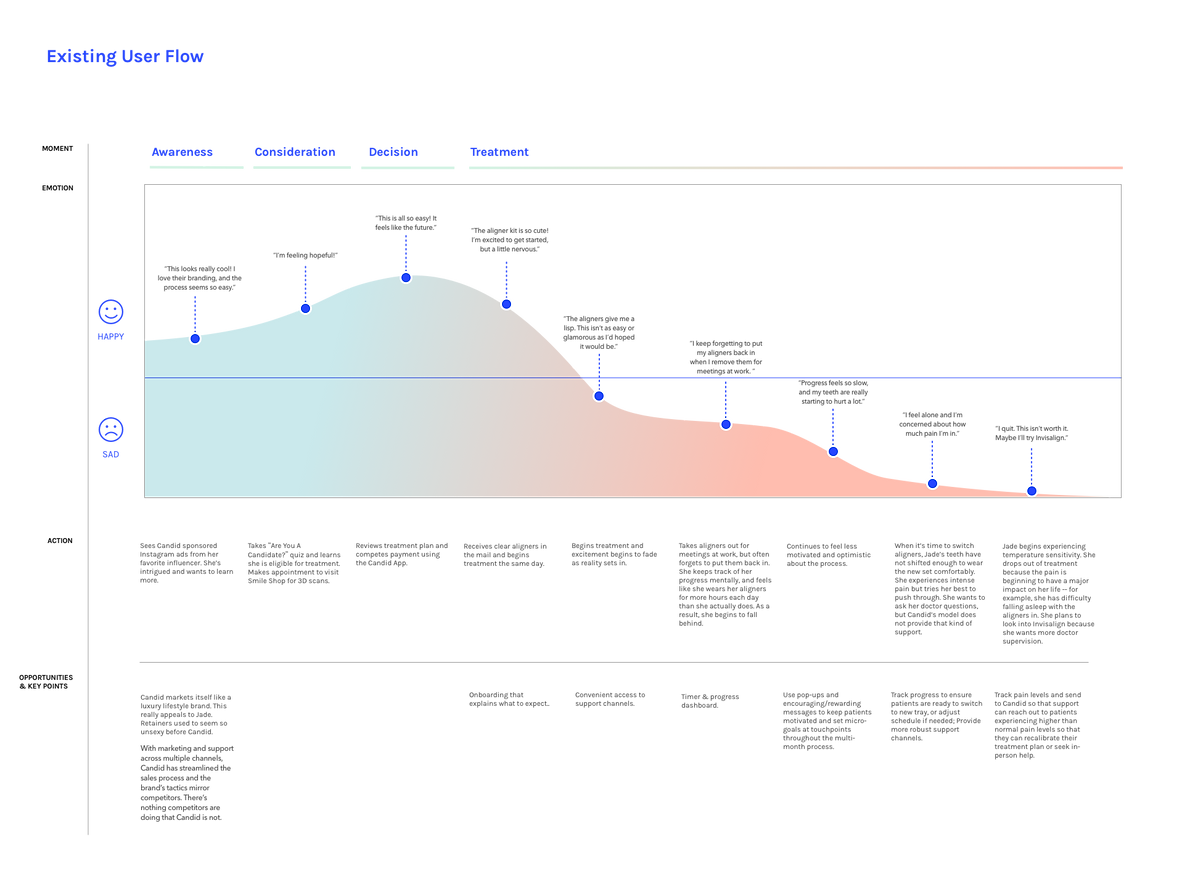
Better care with a dashboard.
Direct-to-consumer aligner companies like Candid have succeeded in making orthodontic care more appealing and accessible than ever before.
But keeping customers on track for success remains a challenge, as wearing a dental device is inconvenient and uncomfortable.
We designed an app that gamifies the experience to keep patients engaged, while delivering pertinent data back to Candid to proactively identify patients at risk of dropping out due to the pain and discomfort they experience when they fall behind in treatment.


Brief
Discovery
The project brief called for a mobile app that would help Candid "transform teledentistry", using AR technology and 3-D scans.
But as we began discovery, we quickly learned that even the most tech-savvy consumers don't yet trust their smartphones to deliver medical-grade orthodontic care. So we got to work exploring other ways to improve the Candid experience through mobile technology.
We interviewed six current or former invisible aligner customers, two customer care representatives, and scoured forums on Reddit and Facebook for insights into the current Candid experience. Every customer we spoke with had trouble meeting the requirements of their treatment plan — wearing a retainer for 22 hours per day. As a result, most of these individuals had dropped out of treatment multiple times.

"I always forget to put my aligners back in after a meal."

"I'm not sure how long I wear my aligners each day. I wish I could track it."

"I switched to Invisalign because I wanted a doctor's
supervision."

"I dropped out twice because I can't keep up with the required hours."

"I want to see my progress throughout the process."

"I quit because I started experiencing severe pain. It was scary not having a doctor to turn to."
Synthesis
Our research revealed an opportunity to improve customer retention by addressing a gap in communication that occurs after patients begin treatment.
A lackluster post-sales experience was leading to significant customer drop-off. The process of straightening one's teeth is inherently painful and customers want to feel they are in good hands. When they don't, they cancel their treatment — either abandoning the idea altogether, or switching to competitors like Invisalign, who offer ongoing, in-person orthodontist support.

Jade White
Customer Journey Map
Design
To address the customer pain-points and business opportunities we identified, we designed a branded, fitness-inspired app with daily reminders, timers, notifications, and access to multiple channels of support to help patients stay on track with their treatment.
As we progressed through several design iterations and gathered feedback, we learned that users will passively interact with the app at multiple touch points throughout the day, making, push notifications and haptic interactions a critical piece of our final design.

Design Studio + Card Sort
Each member of the team developed a design scheme. We cut up the components, added in screens from similar apps, and asked users to piece together their ideal app.
Lo-Fi Mockup
After testing our designs on paper, we mocked up our best-performing solution in Adobe XD and continued to test and iterate.


Design Iterations
After switching from greyscale to color, users found the circle graph confusing, leading to further layout and color explorations.
Redesign Concepts
As an independent designer, I continued to explore and test different variations on the initial concept.


Hi-Fi Prototype II
The latest design iteration incorporates all previous user feedback, as well as new features like a pain scale reporting modal, more push notifications, and Watch OS screens.
