Daikin
Mobile application design
/2020
Daikin
Mobile application design
/2020

My Role:
UX Architect/Designer—discovery, user research, wireframes, design, testing
Team:
Abhay Srivastava — Solution Architect
Yuze Sun — Project Manager
John Meng — UX Architect
Kamalam Tadikonda — Mobile Engineer
Methods:
Competitive analysis
Market research
Stakeholder workshop
Customer workshops
User testing
Interviews
Tree testing
Surveys
Affinity mapping
+ tons of collaboration :)
HVAC technicians need a library of technical documents at their fingertips when working in the field. Daikin had an app for that, but wanted to increase engagement and improve the overall experience for contractors. I led the redesign of a more intuitive search, and expanded features like interactive troubleshooting, personalization, and a more robust error code flow.
Set to release in winter 2020, this app is expected to reduce Daikin's call center volume significantly by making it easier for technicians to find the information they need.

Problem
The client, a multinational manufacturing company, engaged Softway to redesign an existing mobile app that HVAC contractors use to help them find the information they need to install and service heating and cooling units. The client hoped to redefine the standard of customer service with this tool as they worked to break into a new market.
Modern HVAC systems employ advanced technology, making digital, on-demand manuals a critical tool for HVAC contractors and technicians. The app our client had developed for this purpose was falling short, and as a result, the client's North America call center was stretched beyond capacity with basic queries, and the client was losing face with customers in a key market. We needed to redesign the app so that users could find what they needed with just a few taps.
How do you design an app that makes technical tasks as effortless as possible?


-> I interviewed a long list of stakeholders and clients to better understand the problem and the intricate client ecosystem of which this app is a part. This research revealed two key issues to solve:
-
App users can’t find what they need fast enough because the information organized in a way that's not at all intuitive to technicians.
-
Those who are able to successfully navigate the app often find the information incomplete or insufficient for their needs (e.g. the meaning of an error code is revealed, but next steps are not.)
Daikin’s document library was not organized in a way that was intuitive to contractors. When they’re on a job, the first thing they ask is, “what device am I looking at” — they want to see all available resources for that particular model. Instead, Daikin’s app was organized by document type, and contractors described the experience of searching this way as feeling like, “here’s a thousand pieces of information, have at it,” or “it’s almost like we’re not speaking the same language.”
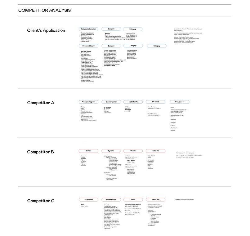
-> ABOVE:
A competitor analysis further highlighted the need to simplify the app's information architecture, and provided a guide for familiar patterns.
-> BELOW:
Mockups from a dot voting exercise used during a user workshop. Users wanted a combination of #3 and 4.

Workshopping
After our initial interviews with a handful of users, we had one shot to test our designs with users—a 200-person summit for contractors. We had one hour to collect meaningful design feedback and make 200 contractors feel like design partners.
How do you get meaningful design feedback from 200 users in one hour?
I came up with an unorthodox plan to achieve these goals. We split the group up and facilitated 5 sessions with 2 distinct programs. One involved more intensive interviewing and testing, hosted by myself and another UXer familiar with the project, and another that was more process-driven, hosted by technical team members with less facilitation experience.
Outcomes:
- new hybrid homes screen layout and combined elements of the top 2 we showed
- validation of search and error code flows
- identification of gaps in IA/different mental models (see tree test screenshots below)
- identification of need for “folders” and realization that we could use this to personalize the experience
-better understanding of how app use would look day-to-day
- realization of the importance of dip-switch settings


-> ABOVE:
Tree test results showed aspects of our IA that were unclear.
-> BELOW:
Home screen iterations based on workshop feedback, combining visual product listing, search, and recent/saved documents.
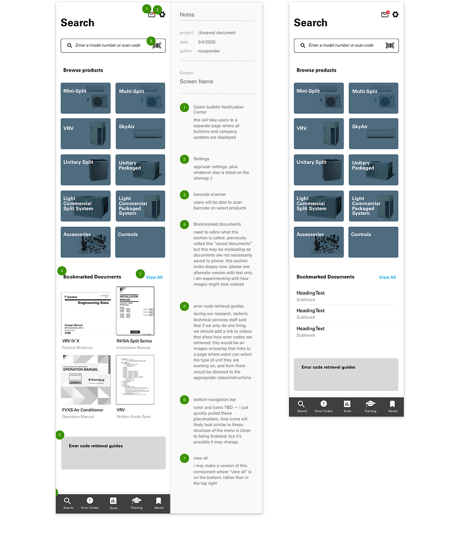

-> SEARCH
The search screen supports different mental models — users can browse or search by model number or category.
In testing, users liked the visual layout with large buttons and images to identify different product families.
Recent/saved documents personalize the experience. As a result of testing, we took this a step further to enable users to create project folders when we learned they often maxed out their phone storage trying to achieve this on their own.

Predictive search results and intuitive steps & categories guide users to product pages and remove the need for time-consuming guesswork. Users are now able to find what they need in a few taps.

-> PRODUCT INFO
Tabs in the product listing satisfy the client's request to organize product information within "hubs", while supporting different ways to search.

-> TROUBLESHOOTING
We worked with the client to devise strategies to produce new content that was absent from the current CMS, and are scaling this module as that new content becomes available.

-> DESIGN SYSTEM
We implemented and augmented the client's existing design system across this application.
Product pages feature expandable tabs for documents, field settings, and other key information categories. The modular design can be easily modified to accommodate additional features in the future.


Our client wanted to redefine HVAC service, and this initial offering is a small step towards that. When we pitched the project, we envisioned two different futures, based on needs and opportunities identified through our research findings. The first was a voice-controlled assistant with AR/VR features to guide technicians through installation and troubleshooting. The second was a ticket manager, where technicians no longer need to search for anything because dispatchers proactively push all the information they need to their phones in advance. As we prepare to launch the MVP, with the features shown here and many more, I am excited to see the shape this product takes as it continues to scale.